Bullshit Outliers

Once upon a time, I asked a colleague for their dataset featured in a published article.  The article produced a significant correlation between two variables, and I wanted to reproduce the findings using their dataset.  Lo and behold, I was able to successfully replicate the correlation!  However, when I further inspected their data, I noticed a particular concern.  It seemed that the significance of the relationship hinged on a single value that could be considered an outlier.  I struggled with whether I should bring this up to my colleague, but I finally did after much thought.  Their response educated me on outliers, but it also exposed me to a new type of Statistical Bullshit – and how reasonable statistical practices could be confused for Statistical Bullshit.

Today’s post first discusses Statistical Bullshit surrounding outliers.  Then, I summarize the discussion that I had with my colleague, and why things don’t always seem as they appear when it comes to outliers and Statistical Bullshit!


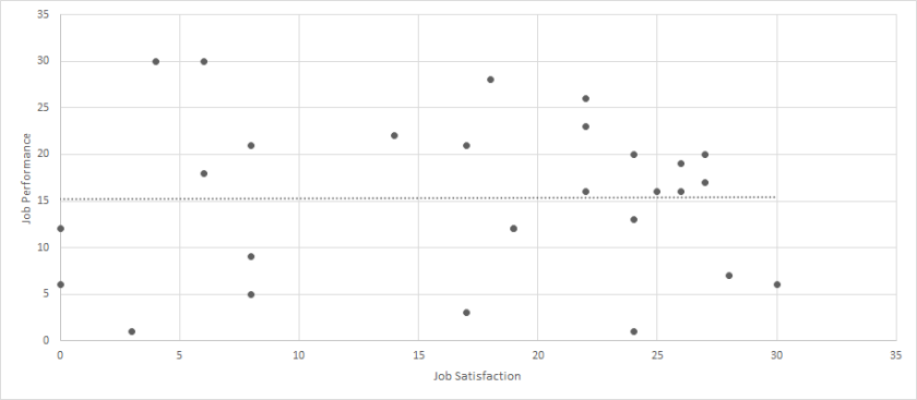
While many different types of outliers can be classified, today’s post discusses three.  The first uses the following dataset:  Click Here for Dataset .  In this dataset, we have job satisfaction and job performance recorded for 29 employees.  Each scale ranges from 0 to 100.  When we calculate a correlation between these two variables, we get a perfect and statistically significant relationship (r = 1.00, p < .01).  But let’s look at a scatterplot of this data.

Bullshit Outliers Figure 1

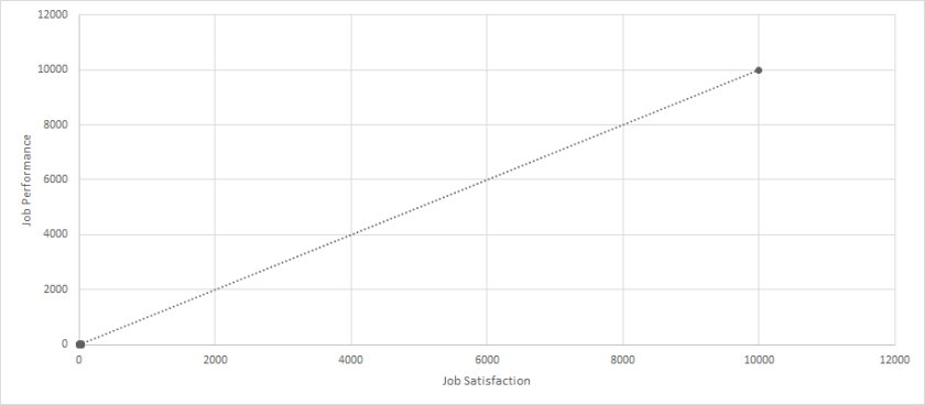
Hmm, clearly something is wrong!  This is because one employee had missing data for both variables, and the missing data was coded as 9999; however, when the analyses were performed, the 9999 was not properly removed and/or the program was not told that 9999 represented missing data.  When we run the analyses again with the outlier removed, the correlation is small and not statistically significant (r = .08, p > .05).

Bullshit Outliers Figure 2

I label this type of outlier as a researcher error outlier.  Numerically it is an outlier, but it does not represent actual data.  In all cases, this outlier should certainly be removed.

Next, let’s use the following dataset to discuss a second type of outlier: Click Here for Dataset.  Again, we have job satisfaction and job performance recorded for 29 employees.  Each scale ranges from 0 to 100.  When we calculate a correlation between these two variables, we get a very strong and statistically significant relationship (r = .76, p < .01).  But let’s look at a scatterplot of this data.

Bullshit Outliers Figure 3

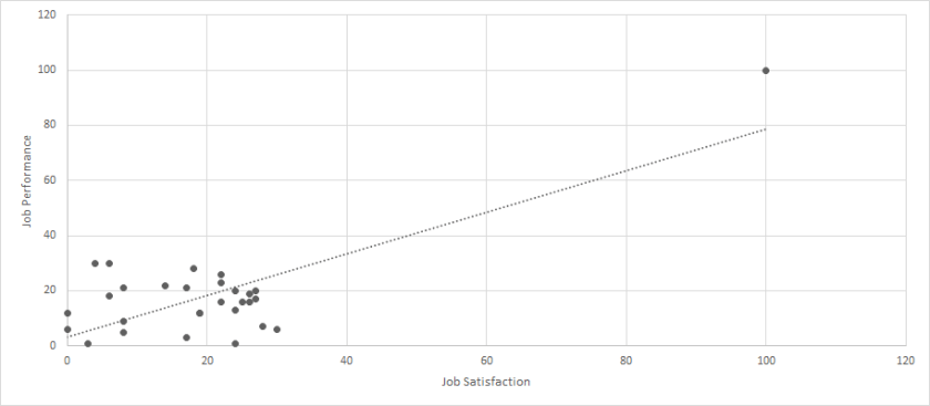
Interesting.  We certainly have an outlier, but it is not clearly “wrong.”  Instead, it seems that most of the sample falls within the range of 0-30 for each variable, but one person had a value of 100 for both.  When we run the analyses again with the outlier removed, the correlation is small and not statistically significant (r = .01, p > .05).

Bullshit Outliers Figure 4

But, before being satisfied with our removal, we should strongly consider what this means for our data.  The occurrence of the one person certainly throws off our results, but this one person does indeed represent actual, meaningful data.  So, can we justify removing this person?  This question can be partially answered by determining whether we are interested in all employees or typical employees.  If we are interested in all employees, then the outlier should certainly stay in the dataset.  If we are interested in typical employees, then the outliers should possibly be removed.  No matter the decision, however, researchers and practitioners should report all of their analytical decisions, so that any readers could be aware of changes to the data before further analyses were conducted.

I label this type of outlier as an extreme outlier.

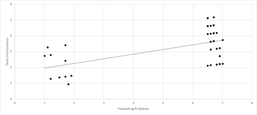
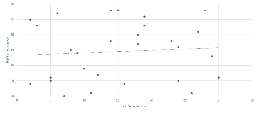
Lastly, let’s use the following dataset to discuss a third type of outlier:  Click Here for Dataset.  Again, we have job satisfaction and job performance recorded for 29 employees.  Each scale ranges from 0 to 100.  When we calculate a correlation between these two variables, we get a moderate and statistically significant relationship (r = .32, p < .01).  But let’s look at a scatterplot of this data.

Bullshit Outliers Figure 5

Now, we certainly have an outlier, but it is much closer to the other values.  While most of the sample falls within the range of 0-30 for each variable, but one person had a value of 43 for both.  When we run the analyses again with the outlier removed, the correlation is small and not statistically significant (r = .07, p > .05).

Bullshit Outliers Figure 6

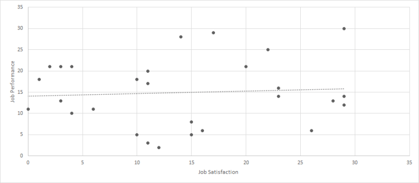
Like the prior case, we need to strongly consider whether we should remove this participant.  It would be much more difficult to argue that this person represents unreasonable data, and it may even be difficult to argue that this person represents data that deviates from the typical population.  Yes, the person is a little extreme, but they are not drastically different.  For this reason, it is likely that we want to keep this observation within our sample.  I label this type of outlier as a reasonable outlier.

So, how is this relevant to Statistical Bullshit?  Well, for researcher error outliers, the entire significance of a relationship could be built on a single mistake.  Large decisions could be made based on nothing factual at all.  Similarly, for extreme outliers, our relationship could largely be driven by a single person, and our decisions could be overly influenced by this single person.  Lastly, for reasonable outliers and some extreme outliers, we could choose to remove these observations, which could result in a very different relationship that we could base our decisions.  However, our decisions would be based on only a portion of the sample, and we could be missing out on very important aspects of the population.  Thus, both not removing and removing outliers could result in Statistical Bullshit!

To bring this post full-circle, what happened when I chatted with my colleague?  As you probably guessed, the outlier was determined to be a reasonable outlier.  Certainly an outlier, but not enough to be confidently considered outside the typical population range.  After our conversation, I certainly saw their point, and felt that they made the correct decision with their analyses – and it helped me understand how to conduct my analyses in the future.

Well, that’s all for today!  If you have any questions, comments, or stories, please email me at MHoward@SouthAlabama.edu.  Until next time, watch out for Statistical Bullshit!

Correlation Does NOT Equal Causation

Your variables may be related, but does one really cause the other?

Most readers have probably heard the phrase, “correlation does not equal causation.”  Recently, however, I heard someone confess that they’ve always pretended to know the significance of this phrase, but they truly didn’t know what it meant.  So, I thought that it’d be a good idea to make a post on the meaning behind “correlation ≠ causation.”

Imagine that you are the president of your own company.  You notice one day that your highly-payed employees perform much better than your lower-payed employees.  To test whether this is true, you create a database that includes employee salaries and their performance ratings.  What do you find?  There is a strong correlation between employee pay and their performance ratings.  Success!  Based on this information, you decide to improve your employees’ performance by increasing their pay.  You’re certain that this will improve their performance. . .right?

Not so fast.  While there is a correlation between pay and performance, there may not be a causal relationship between the two – or, at least, such that pay directly influences performance.  It is fully possible that increasing pay has little effect on performance.  But why is there a correlation?  Well, it is also possible that employees get raises due to their prior performance, as the organization has to provide benefits in order to keep good employees.  Because of this, an employee’s high performance may not be due to their salary, but rather their salary is due to their prior high performance.   This results in current performance and pay having a strong correlational relationship, but not a causal relationship such that pay predicts performance.  In other words, current performance and pay may be correlated because they have a common antecedent (past performance).

This is the idea behind the phrase, “correlation does not equal causation.”  Variables do not necessarily have a causal relationship just because they are correlated.  Instead, many other types of underlying relationships could exist, such as both having a common antecedent.

Still don’t quite get it?  Let’s use a different example.  Prior research has shown that ice-cream sales and murder rates are strongly correlated, but does that mean that ice cream causes people to murder each other?  Hopefully not.  Instead, it is that warm weather (i.e. the summer) causes people to (a) buy ice cream (b) and be more aggressive.  This results in both ice-cream sales and murder rates.  Once again, these two variables are correlated because they have a common antecedent – not because there is a causal relationship between the two.

Correlation does not imply causation

Hopefully you now understand why correlation does not equal causation.  If you don’t, please check out one of my favorite websites:  Spurious Correlations.  This website is a collection of very significant correlations that almost assuredly do not have a causal relationship – thereby providing repeated examples of why correlation does not equal causation.  If you do understand, beware of this fallacy in the future!  Organizations can make disastrous decisions based on falsely assuming causality.  Make sure that you are not one of these organizations!

Until next time, watch out for Statistical Bullshit!  And email me at MHoward@SouthAlabama.edu with any questions, comments, or stories.  I’d love to include your content on the website!

What is in a Mean? A Reader Story

Does your company make large-stake decisions based on means alone? A reader tells the story.

I recently had a reader of StatisticalBullshit.com tell me a story regarding the post, “What is in a Mean?”  This story is a perfect illustration of Statistical Bullshit in industry, and why you should be aware of these and similar issues.  I have done my best to retell it below (with a few details changed to ensure anonymity).  As always, feel free to email me at MHoward@SouthAlabama.edu if you have any questions, comments, or stories.  I would love to include your email on StatisticalBullshit.com.  Until next time, watch out for Statistical Bullshit!


I was hired as a consultant for a company that recently had recently become obsessed with performance management.  The top management of the company was recently under the impression that their workteams were terribly inefficient, and somehow they decided that the teams’ leadership was to blame.  The company had given survey after survey, analyzed the data, interpreted the data, implemented new changes, and continuously monitored performance; however, the workteams were still not performing at the standard that they had hoped.

So, I was brought in to help fix the problem.  My first decision was to review the surveys that the organization was using to measure performance and related factors.  The surveys were very simple, but they weren’t terrible.  First, performance was measured by having a member of top management rate the outcome of the workteam.  Next, the leader of the workteam was rated by team members on 11 different attributes.  These included:

  • Managed Time Effectively
  • Communicated with Team Members
  • Foresaw Problems
  • Displayed Proper Leadership Characteristics
  • Transformed Team Members into Better People

Overall, I thought it wasn’t bad, and my second decision was to ask about prior analyses.  When they delivered the prior analyses, I was confused that they only provided mean calculations.  I immediately went to the top management and asked for the rest.  They exasperatedly proclaimed, “Why do you need anything else!?  The means are right there!”

I was taken aback.  What!?  They only calculated the means?  I asked, “What do you mean by that?”

They sent me a table very similar to the following:

Mean Rating (From 1 to 7 Scale)

Managed Time Effectively

6.3

Communicated with Team Members

5.9

Foresaw Problems

5.5

Displayed Proper Leadership Characteristics

6.1

Transformed Team Members into Better People

2.5

“See!  Our leaders are struggling with transforming team members into better people!  This is obviously the problem, which is why we’ve made every leader enroll in mandatory transformation leadership courses.”

I immediately knew that this wasn’t right, but I needed a little time (and analyses) to make my case.  I first calculated correlations of the related factors with team performance, and they looked like this:

Correlation with Team Performance

Managed Time Effectively

.24**

Communicated with Team Members

.32**

Foresaw Problems

.52**

Displayed Proper Leadership Characteristics

.17*

Transformed Team Members into Better People

.02

* p < .05, ** p < .01

A-ha!  This could be the issue!  While leaders could improve on transforming team members into better people, the data suggested that this factor did not have a significant effect on team performance.  So, I then calculated a regression including all the related factors predicting team performance:

β

Managed Time Effectively

.170*

Communicated with Team Members

.082

Foresaw Problems

.389**

Displayed Proper Leadership Characteristics

.113

Transformed Team Members into Better People

.010

* p < .05, ** p < .01

Again, the data suggested that transforming team members into better people did not have an effect on team performance.  Instead, the strongest predictor was foreseeing problems.  I lastly created a scatterplot of the relationship between foreseeing problems and team performance:

Foreseeing ScatterPlot

There is the problem!  There were two groups of team leaders – those that could foresee problems and those that could not.  Those that foresaw problems led teams with high performance, whereas those that could not foresee problems led teams with low performance.  So, although the mean of foreseeing problems was not all that different from the other factors, it turned out to have the largest effect of them all.  On the other hand, while transforming team members into better people had a mean that was much lower than the other factors, it did not have a significant effect at all.

With this information, I suggested that the organization should cut back on the transformational leadership training programs (after ensuring that they did not provide other benefits), and instead train leaders on how to anticipate problems.  Through doing so, they could (a) save money (b) and finally reach the level of team performance that they had been wanting.  I am unsure whether they implemented my recommendations, but I hope they learned a valuable lesson from my analyses:

Means should not be used to infer relationships between variables, and to always watch out for Statistical Bullshit – even if you accidentally do it yourself!


Note:  The variables in this story have been changed to protect the identity of the reader.  Please do not make management decisions based on these analyses.