Bullshit Measurement

Are you measuring what you think you’re measuring? Could you be measuring something else entirely?

Accurate measurement of variables is essential for business success.  Sometimes, it’s fairly easy to record these variables – sales, revenue, profit.  Other times, it can be very very difficult.  For example, let’s say that you want to hire employees that are smart and conscientious.  How can we measure intelligence and conscientiousness?

Well, a good starting point is to develop a test or survey.  Many intelligence tests exist with varying levels of sophistication and accuracy, and you could pay to give these tests to applicants.  Many self-report surveys also exist that can measure conscientiousness, and you could pay to give these tests to applicants, too.  But what if you don’t want to use one of these existing measures?  What’s the worst that could happen?

In this post, we won’t talk about the worst that could happen, but we’ll discuss a pretty bad outcome: when your measure inadvertently gauges the wrong construct, which could result in a lawsuit.

I should also note that this example comes from an actual consulting experience that I encountered.  The names have been changed, but remember that these things actually happen in industry!


I was once hired along with a full team to review the new selection system of a trendy company.  Let’s call them X-Corp.  X-Corp wanted their selection to measure a construct that they invented: “the ideal X-Corp employee.”  They made a list of the ideal X-Corp employee characteristics.  It included the common constructs like intelligence and conscientiousness, but it also included some unorthodox constructs.  These included hip, stylish, savvy, sleek and so fourth.  X-Corp argued that the ideal employee needed to appeal to any potential customers, and therefore needed to have these characteristics; however, my team was already doubtful about the business relevance of theses constructs.

Even more concerning, X-Corp felt that their survey had to attract people to work for X-Corp.  For this reason, it couldn’t be a traditional survey.  It had to be different and exciting.  Once again, we were doubtful about how exciting a selection survey could be.

When we saw the survey to measure “the ideal X-Corp employee,” we began to worry even more.  The first question looked something like this:

Bullshit Measurement 1

What?

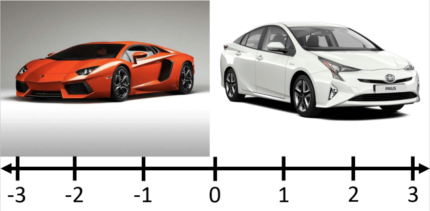
The text of the item read, “Using the scale, please indicate whether you are more like a sports car or a hybrid/electric car.”

…What?

Immediately, we asked X-Corp what this item was meant to measure.  Sure enough, they just said “the ideal X-Corp employee.”  We asked which subdimension, specifically, was the item meant to measure.  As they couldn’t respond, we realized that they didn’t really have an idea.  It seemed that they just put things in their survey that they thought would be a good idea without really thinking about the ramifications.

Do you think this item would help identify good employees?  Well, we first have to ask what is the “correct” answer.  According to X-Corp, the correct answer was being more like a hybrid/electric car.  So, anyone would indicated that they were more like a sports car got the item wrong.  Do you think this is fair?  More importantly, do you think those that feel more like a “hybrid/electric car” are necessarily better than those that feel more like a “sports car?”  I would guess that the answer is probably not.  There are probably many sports car people that are more intelligent, conscientious, hip, savvy, and so on when compared to hybrid/electric car people.  Thus, this item probably fails to measure “the ideal X-Corp employee.”

That item was bad, but it wasn’t the worst.  The worst was probably the following item:

Bullshit Measurement 2

Once again, what?

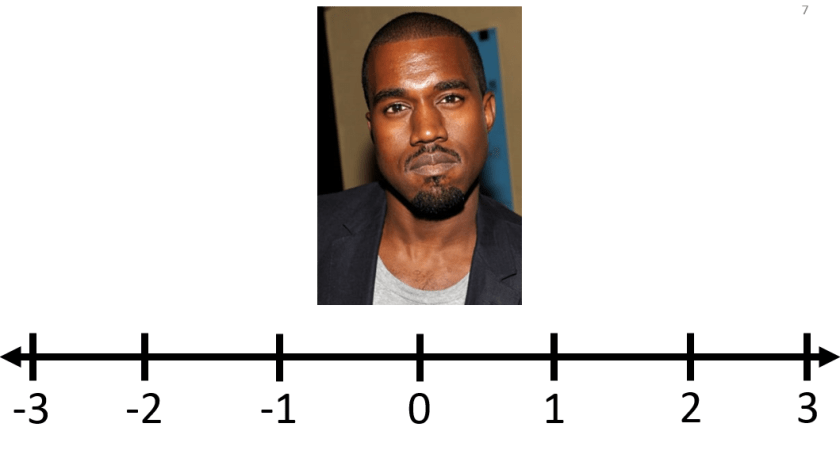
The text of the item read, “Using the scale, please indicate whether you are more or less like Kanye West.”

Once again…what?

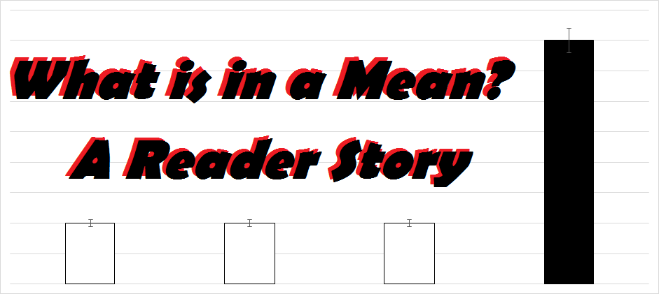
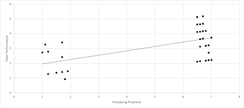
X-Corp claimed that Kanye West was too narcissistic, and anyone who felt that they were like Kanye were not welcome at X-Corp.  Do you think that Kanye people are inherently worse than non-Kanye people?  Once again, I am guessing that the answer is probably not. Kanye people are probably just as good as non-Kanye people, and perhaps even better in some regards (i.e. creative, hip, etc.).  But can you think of anything else that this item might inadvertently measure?  Let’s look at the graph below, which is similar to the actual results.

Bullshit Measurement Graph

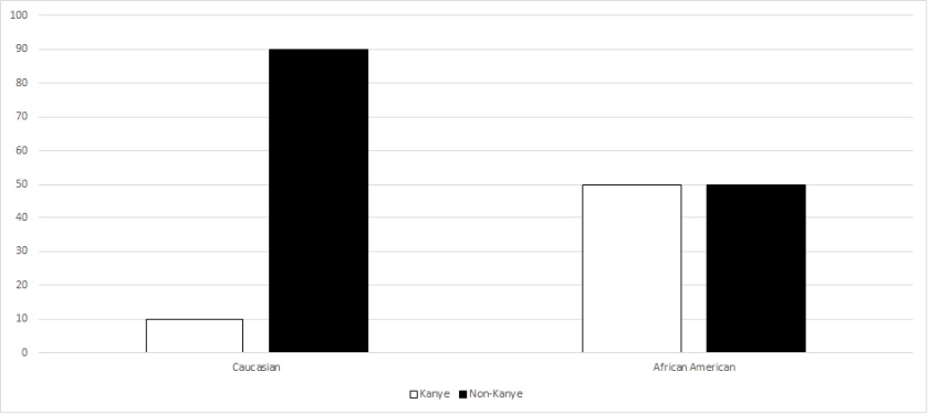
As some of you may have guessed, African Americans were much more likely to see themselves similar to Kanye than Caucasians.  This makes sense, as Kanye himself is African American.  Thus, this item partially measures the applicant’s ethnicity.

Remember when I said that those responding that they were more like Kanye were rated as worse applicants?  If this survey went live, that would mean that African Americans would automatically be penalized, thereby resulting in adverse impact.  This would almost assuredly result in a lawsuit, in which X-Corp could not justifiably defend – or, at least, have a very hard time defending that the Kanye question actually represented job performance.  This would have cost the company millions of dollars!

In the end, my team strongly recommended that the company should not use their selection survey, and should instead use a traditional survey.  The company wasn’t happy, and we were never asked to work with the company again.  But, they did guarantee that they would not use their selection system.  While it wasn’t the most satisfying result, I was happy that we were able to stop another case of Statistical Bullshit!

If you have any questions or comments about this story, feel free to contact me at MHoward@SouthAlabama.edu .  Also, feel free to contact me if you have any Statistical Bullshit stories of your own.  I’d love to include them on StatisticalBullshit.com!

Bullshit Charts

Is Statistical Bullshit possible when no numbers are involved?

Possibly the most widespread form of Statistical Bullshit is Bullshit Charts.  Charts are meant to provide clear and easy-to-read information, but Bullshit Charts are designed to mislead the reader – whether intentionally or unintentionally.  Often, these charts will alter common cues that the reader expects, hoping that the reader will not notice these subtle changes.  Through doing so, the chart is not “lying” per se, but it is certainly Statistical Bullshit!

Bullshit Charts are common in situations with little time to process all relevant information, such as during a commercial or business meeting.  And I’m sure you’ve experienced this before.  Maybe a commercial presented a chart for a split second, showing that their product is superior to others.  It may have looked reasonable, but if you could only pause the TV, you could have seen that the x- or y-axis was mislabeled.  In other words, it was indeed a misleading Bullshit Chart.

Below are some of my favorite examples of Bullshit Charts.  The Statistical Bullshit should be apparent in each of these charts, but please email me at MHoward@SouthAlabama.edu if you have any questions or comments about these charts.  Until next time, watch out for Statistical Bullshit!


1.  Need to make your argument seem more convincing?  Just give yourself a bigger slice of the pie no matter what the data shows…

Bullshit Charts 1

2.  Again, just change the distribution of the pie to help your case!  Or make up the data, as these labels and percentages seem to not make any sense at all…

Bullshit Charts 2

3.  Or, just ignore the size of the bars.

Bullshit Charts 3

4.  Does the data disprove your claim?  Just flip the chart upside down to make it seem like you’re correct!

Bullshit Charts 4

5.  Although those in the Philippines may only be ~.2 meters shorter than those in The Netherlands, you can always draw them as about 1/3rd the size to prove a point…

Bullshit Charts 5

6.  Again, you could just ignore the size of the bars altogether.

Bullshit Charts 6

7.  I’ve seen this trend catching on more recently.  Three-dimensional charts are often difficult to read.  If you want to prove a point, it is rarely a good idea to use 3-D charts.

Bullshit Charts 7

8.  Then again, some two-dimensional charts aren’t much better…

Bullshit Charts 8

9.  So, sometimes it’s just easiest to go back to giving yourself a bigger slice of the pie.

Bullshit Charts 9

10.  If all else fails, just give your chart nonsense labels and just hope for the best!

Bullshit Charts 10

Sources for these and other Bullshit Charts:

https://www.reddit.com/r/dataisugly/

https://www.reddit.com/r/shittydataisbeautiful/

https://www.reddit.com/r/badstats/


What is in a Mean? A Reader Story

Does your company make large-stake decisions based on means alone? A reader tells the story.

I recently had a reader of StatisticalBullshit.com tell me a story regarding the post, “What is in a Mean?”  This story is a perfect illustration of Statistical Bullshit in industry, and why you should be aware of these and similar issues.  I have done my best to retell it below (with a few details changed to ensure anonymity).  As always, feel free to email me at MHoward@SouthAlabama.edu if you have any questions, comments, or stories.  I would love to include your email on StatisticalBullshit.com.  Until next time, watch out for Statistical Bullshit!


I was hired as a consultant for a company that recently had recently become obsessed with performance management.  The top management of the company was recently under the impression that their workteams were terribly inefficient, and somehow they decided that the teams’ leadership was to blame.  The company had given survey after survey, analyzed the data, interpreted the data, implemented new changes, and continuously monitored performance; however, the workteams were still not performing at the standard that they had hoped.

So, I was brought in to help fix the problem.  My first decision was to review the surveys that the organization was using to measure performance and related factors.  The surveys were very simple, but they weren’t terrible.  First, performance was measured by having a member of top management rate the outcome of the workteam.  Next, the leader of the workteam was rated by team members on 11 different attributes.  These included:

  • Managed Time Effectively
  • Communicated with Team Members
  • Foresaw Problems
  • Displayed Proper Leadership Characteristics
  • Transformed Team Members into Better People

Overall, I thought it wasn’t bad, and my second decision was to ask about prior analyses.  When they delivered the prior analyses, I was confused that they only provided mean calculations.  I immediately went to the top management and asked for the rest.  They exasperatedly proclaimed, “Why do you need anything else!?  The means are right there!”

I was taken aback.  What!?  They only calculated the means?  I asked, “What do you mean by that?”

They sent me a table very similar to the following:

Mean Rating (From 1 to 7 Scale)

Managed Time Effectively

6.3

Communicated with Team Members

5.9

Foresaw Problems

5.5

Displayed Proper Leadership Characteristics

6.1

Transformed Team Members into Better People

2.5

“See!  Our leaders are struggling with transforming team members into better people!  This is obviously the problem, which is why we’ve made every leader enroll in mandatory transformation leadership courses.”

I immediately knew that this wasn’t right, but I needed a little time (and analyses) to make my case.  I first calculated correlations of the related factors with team performance, and they looked like this:

Correlation with Team Performance

Managed Time Effectively

.24**

Communicated with Team Members

.32**

Foresaw Problems

.52**

Displayed Proper Leadership Characteristics

.17*

Transformed Team Members into Better People

.02

* p < .05, ** p < .01

A-ha!  This could be the issue!  While leaders could improve on transforming team members into better people, the data suggested that this factor did not have a significant effect on team performance.  So, I then calculated a regression including all the related factors predicting team performance:

β

Managed Time Effectively

.170*

Communicated with Team Members

.082

Foresaw Problems

.389**

Displayed Proper Leadership Characteristics

.113

Transformed Team Members into Better People

.010

* p < .05, ** p < .01

Again, the data suggested that transforming team members into better people did not have an effect on team performance.  Instead, the strongest predictor was foreseeing problems.  I lastly created a scatterplot of the relationship between foreseeing problems and team performance:

Foreseeing ScatterPlot

There is the problem!  There were two groups of team leaders – those that could foresee problems and those that could not.  Those that foresaw problems led teams with high performance, whereas those that could not foresee problems led teams with low performance.  So, although the mean of foreseeing problems was not all that different from the other factors, it turned out to have the largest effect of them all.  On the other hand, while transforming team members into better people had a mean that was much lower than the other factors, it did not have a significant effect at all.

With this information, I suggested that the organization should cut back on the transformational leadership training programs (after ensuring that they did not provide other benefits), and instead train leaders on how to anticipate problems.  Through doing so, they could (a) save money (b) and finally reach the level of team performance that they had been wanting.  I am unsure whether they implemented my recommendations, but I hope they learned a valuable lesson from my analyses:

Means should not be used to infer relationships between variables, and to always watch out for Statistical Bullshit – even if you accidentally do it yourself!


Note:  The variables in this story have been changed to protect the identity of the reader.  Please do not make management decisions based on these analyses.