What is in a Mean?

When are mean comparisons appropriate? And when are they Statistical Bullshit?

This post is inspired by an interaction that I had while consulting.  I was hired as a statistical analyst, and my duties included reviewing analyses that were already conducted internally.  Most of the organization’s prior analyses were appropriate, but I noticed that certain assumptions were based on completely inappropriate mean comparisons.  These assumptions led to needless practices that cost time and money – all because of Statistical Bullshit.  Today, I want to teach you how to avoid these issues.

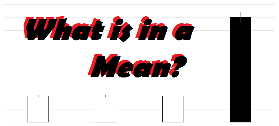
Let’s first discuss when mean comparisons are appropriate.  Mean comparisons are appropriate if you (A) want to obtain a general understanding of a certain variable or (B) want to compare multiple groups on a certain outcome.  In the case of A, you may be interested in determining the average amount of time that a certain product takes to make.  From knowing this, you could then determine whether an employee is taking more or less time than the average to make the product.  In the case of B, you may be interested in determining whether a certain group performed better than another group, such as those that went through a new training program vs. those that went through the old training program.  The data from such a comparison may look something like this:

Training Comparison

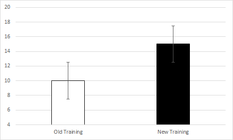
So, from this comparison, you may be able to suggest that the new training program is more effective than the old training program; however, you would need to run a t-test in be sure of this.

Beyond these two situations, there are several other scenarios in which mean comparisons are appropriate, but let’s instead discuss an example when mean comparisons are inappropriate.

Say that we wanted to determine the relationship between two variables.  Let’s use satisfaction with pay (measured on a 1 to 7 Likert scale) and turnover intentions (also measured on a 1 to 7 Likert scale).  As you probably already know, we could (and probably should) determine the relationship between these two variables by calculating a correlation.  Imagine instead that you decided to calculate the mean of the two variables and the results looked like this:

Example 1

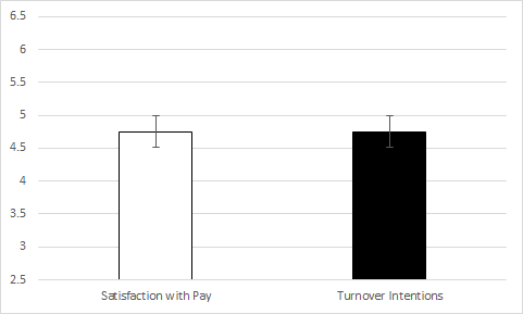
Does this result indicate that there is a significant relationship between the two variables?  In my prior consulting experience, the internal employee who ran a similar analysis believed this to be true.  That is, the internal employee believed that two variables with similar means are significantly related; however, this couldn’t be further from the truth.  Let’s look at the following examples to find out why.

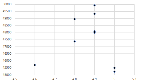
Take the example that we just used – satisfaction with pay and turnover intentions.    Which of the following scatterplots do you believe represents the data in the bar chart above?

Example 2a

Example 2b

Example 2c

Example 2d

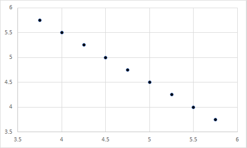
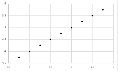
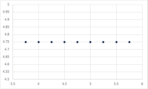
Still don’t know?  Here is a hint:  The first chart represents a correlation of 1, the second represents a correlation of -1, the third represents a correlation of 0, and the fourth represents a correlation of 0.  Any guesses?

Well, it was actually a trick question.  Each figure could represent the data in the bar chart above, because the X and Y variables in each have a mean of 4.75…well, the last one is off by a few tenths, but you get my point.

So, if the means of two variables are equal, their relationship could still be anything – ranging from a large negative relationship, to a null relationship, to a large positive relationship.  In other words, the means of two variables have nothing to do regarding their relationship.

But does it work the other way?  That is, if the means of two variables are extremely different, could they still have a significant relationship?

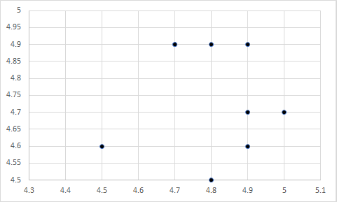
Certainly!  Let’s look at the following example using satisfaction with pay (still measured on a 1 to 7 Likert scale) and actual pay (measured in thousands of dollars).

Sat with Pay and Pay 2

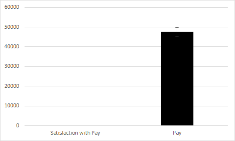
As you can see, the difference in the means is so extreme that you can’t even see one bar!  Now, let’s look at the following four scatterplots:

Example 4a

Example 4b

Example 4c

Example 4d

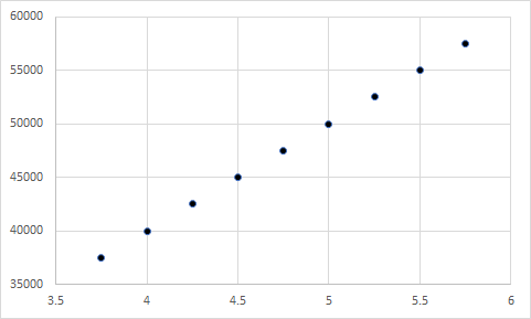
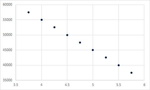
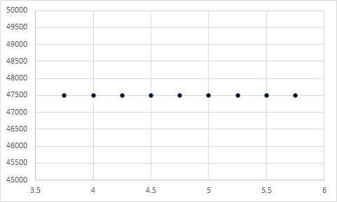
Seem a little familiar?  As you guessed, the first represents a correlation of 1, the second represents a correlation of -1, the third represents a correlation of 0, and the fourth represents a correlation of 0.  More importantly, each of these include a Y variable with a mean of 4.75 and an X variable with a mean of 47500.  Although the means are extremely far apart, they have no influence on the relationship between two variables.

From these examples, it should be obvious that the mean of two variables has no influence on their relationship – no matter if the means are close together or far apart.  Instead, it is the covariation between the pairings of the X and Y values that determine the significance of their relationship, which may be a future topic on StatisticalBullshit.com or even MattCHoward.com (especially if I get enough requests for it).

Now that you’ve read this post, what will you say if you are ever at work and someone tries to tell you that two variables are related because they have similar means?  You should say STATISTICAL BULLSHIT!  Then demand that they calculate a correlation instead…or a regression…or a structural equation model…or other things that we may cover one day.

That’s all for this post!  Don’t forget to email any questions, comments, or stories.  My email is MHoward@SouthAlabama.edu, and I try to reply ASAP.  Until next time, watch out for Statistical Bullshit!


Regression Toward the Mean

Can you make a career on Statistical Bullshit?

Regression Toward the Mean is one of the most common types of Statistical Bullshit in industry.  And, as the title quotation insinuates, some consultants have made an entire career swindling money from organizations through manipulating this statistical phenomenon.  If you are currently in practice, or ever plan to be, read on to discover whether you are currently being swindled out of thousands – or possibly millions!

Businesses are always on a time-series.  That is, most organizations are not worried about the profit that they turned today, but rather the profit that they will turn tomorrow.  For this reason, many types of statistics and methodologies applied in business are meant to analyze longitudinal trends in order to predict future results.

Let’s take perhaps the simplest time-series design: a single variable measured on multiple occasions.  In this example, let’s say that we are looking at overall company revenue in millions.

Month

Revenue

January

10.5

February

10

March

11

April

12.5

May

10.5

June

10

July

12

August

11

September

11

October

5

It seems that the average company revenue over the month was $11 million, but a severe drop occurred in October.  What would you do if your company revenue looked something like this?

Most anyone would say panic and take extreme measures – and that is what most companies do.  A company may replace the CEO, lay-off a large number of workers, or immediately implement a new corporate strategy.  Let’s say that a company does all three for our example, and the result looks like this:

Regression Toward the Mean without Text

Success!  The new CEO is a genius!  The lay-offs worked!  And the new corporate strategy is brilliant!  Right?  Well, maybe not.

The Regression Toward the Mean phenonmemon suggests that a time-series dataset will revert back to its average after an extreme value.  In other words, when an extreme high- or low-value occurs, it is much more difficult to get any more extreme than it is to revert back to the average.  So, in this instance, it is fully possible that the company’s actions successfully caused revenue to revert back to more normal values; however, it is perhaps just as likely that the revenue simply regressed back toward the mean naturally.  So, the new changes (and money spent!) may have actually done very little or even nothing at all…but you can always be sure that the new CEO will take credit for it.

Let’s discuss another common example of Regression Toward the Mean in business.  Imagine you are a floor manager at a factory, and your monthly number of dangerous incidents looks something like this.

Week

Incidents

January

5

February

4

March

8

April

6

May

6

June

4

July

2

August

8

September

5

October

20

Wow!  Quite the spike in incidents!  So, what do you do?  Of course, you’d request for your CEO to bring in a safety expert to reduce the number of dangerous incidents, and I can guarantee that the results will look something like this:

Regression Toward the Mean without Text - 2

Another success!  The safety expert saved lives!  You are brilliant!  As you guessed, however, this may not be the case.

Once again, a Regression Toward the Mean effect may have occurred, and the number of safety incidents naturally reverted back to an average level.  The money spent on the safety expert could have been used for other more fruitful purposes, but you can nevertheless take credit for saving your coworker’s lives.

Despite these two examples (and many many more that could be provided), not all instances of extreme values can be cured by waiting for the values to revert to more typical figures.  Sometimes, an effect is actually occurring, and an intervention is truly needed to fix a problem.  Without it, things could possibly get even worse.

So, what should you do when extreme values occur?  Perform an intervention?  Wait it out?  In academia, the answer is simple.  Most researchers have the luxury of collecting data from a control group that does not receive the intervention, and then comparing the data after a sufficient amount of time has passed.  If the intervention group resulted in better outcomes than the control group, then the intervention was indeed a success.  If the two groups have roughly equal outcomes, then the intervention had no effect.

Businesses do not have such luxuries.  Decisions need to be made quickly and correctly – or else someone could lose their job (or their life!).  For this reason, it is often common practice to go ahead and perform the intervention.  If the values return to normal, then you seem like a genius.  If they do not, then at least you tried.  On the other hand, if you do nothing and the values return to normal, then you seem like a genius again.  If they do not return to normal, however, then it seems like you ignored the severity of the issues.  The table below summarizes this issue:

Values Remain Extreme

Values Return to Normal

Do Nothing

You Ignored the Issue

You Succeeded!

Do Something

You Tried

You Succeeded!

Long story short, you should probably make an attempt to fix the issue, although it may simply be Statistical Bullshit in the end.

Before concluding, one last question should be answered about Regression Toward the mean: How exactly can people make a career on it?

Well, imagine that you are a safety consultant, and you receive several consulting offers at once.  You look at the companies, and they all seem to have a relatively stable number of incidents; however, you notice one that is going through a period of elevated incidents.   Now that you know about Regression Toward the Mean, you know that you should take this company’s offer.  Not only will they (probably) be willing to spend lots of money, but you (probably) need to do very little to reduce the incident rate.  Even if your safety suggestions are bogus, you can still appear to be a competent safety consultant.  Although it may sound crazy, I think you would be surprised how often this occurs in the real-world.

That is all for Regression Toward the Mean.  Do you have your own Regression Toward the Mean story?  Maybe a question?  Feel free to email me at MHoward@SouthAlabama.edu.  Until next time, watch out for Statistical Bullshit!

P-Hacking

Does it hurt to take a peek? Or just leave “unimportant” findings unreported?

For the first post on StatisticalBullshit.com, it seems appropriate to discuss one of the most common instances of Statistical Bullshit: p-hacking!

What is p-hacking?  Well, let’s first talk about p-values.

A p-value is the probability that the observed data occurred due to random chance alone. For instance, when performing a t-test that compares two groups of data, such as performance for two work units, the p-value indicates the likelihood that the observed differences between the two groups occurred due to random chance alone. If the p-value is 0.05, for example, it indicates that there is a five percent likelihood that the observed results occurred due to random chance alone.  So, if the p-value is reasonably small (most often < .05), then we can assume that some effect other than random chance alone caused the observed relationships – and we most often assume that our effect of interest was indeed the cause.  In these instances, we say that the result is statistically significant.

For more information on p-values, visit my p-value page at MattCHoward.com.

So, what is p-hacking?  P-hacking is when a researcher or practitioner looks at many relationships to find a statistically significant result (p < .05), and then only reports significant findings.  For instance, a researcher or practitioner may collect data on seven different variables, and then calculate correlations between each of them.  This would result in a total of 21 different correlations.  They could find one or two significant relationships (p < .05), rejoice, and write-up a report about the significant finding(s).  But is this a good practice?  Definitely not.

Given 21 different correlations, we would expect one or two of them to be significant, even if all the variables were completely randomly generated (and hence should not be significantly related).  This is because the p-value is the likelihood that a result is significant due to random chance alone.  If we expect this random chance to occur five percent of the time, then 21 correlations would produce at least one significant result on average (21 * .05 = 1.05).  So, although a result may be statistically significant, it does not always mean that a meaningful effect caused the finding.

Some readers may still be skeptical that random variables could produce significant findings.  Let me give you another example.  I recently completed two studies in which I had participants predict a completely random future event.  As you probably assumed, no one was able to predict the future even better than random chance alone, which supports that any correct guesses were only achieved by random chance alone.  So, any predictor variables should not be significantly related to the number of correct guesses.  However, I found a statistically significant relationship between gender and the number of correct guesses (r = .21, p < .05), and women are able to predict the future better than men!  Right?

Well, let’s look at the results of the two studies:

Study 1

Study 2

Predictor

Correlation with Number of Correct Guesses

Predictor

Correlation with Number of Correct Guesses

1.) Perceived Ability to Predict the Future

-.08

1.) Perceived Ability to Predict the Future

-.02

2.) Self-Esteem

-.07

2.) Self-Esteem

.09

3.) Openness

.02

3.) Openness

.04

4.) Conscientious

-.01

4.) Conscientious

.01

5.) Extraversion

-.07

5.) Extraversion

-.13

6.) Agreeableness

.03

6.) Agreeableness

.04

7.) Neuroticism

.04

7.) Neuroticism

-.01

8.) Age

.10

8.) Age

.07

9.) Gender

-.04

9.) Gender

.22**

** = p < .01

As you guessed, we cannot claim that women predict the future better than men based on these results.  Given that 18 correlations were calculated, we would naturally assume that one would be significant due to random chance alone, which was likely the relationship between gender and the number of correct guesses.

So, what do we do about p-hacking?

Authors have presented a wide-range of possible solutions, but three appear to be the most popular:

  • Do-away with p-values altogether. A small number of academic journals have been receptive to this issue, and they often request that submitted papers include confidence intervals and discuss effect sizes instead.
  • Report all Many journals now require submissions to include a supplemental table that notes all measured variables not reported in the manuscript.  A growing number of journals have even started to request that submissions include the full dataset(s) with all measured variables.  A growing concern has also been expressed regarding authors that do not report entire studies because they did not support their results (this will likely be a future StatisticalBullshit.com topic).
  • Only test relationships specified prior to collecting data. Recent databases have been created in which researchers can publicly identify relationships to test in their data before it has been collected, and then only test these relationships once the data has been collected.
  • Adjust p-value cutoffs. Many corrections can be made to account for statistical significance due to random chance alone.  Perhaps the most popular is the Bonferroni correction, in which the p-value cutoff is divided by the number of comparisons made.  For instance, if you performed 10 correlation analyses, you would divide the p-value of .05 by 10, resulting in a new p-value cutoff of .005.  Many researchers and practitioners view this as too restrictive, however.
  • Replicating your results can help ensure that a result was not due to random chance alone.  Lighting rarely strikes twice, and the same completely random relationship rarely occurs twice.

While these solutions were developed in academia, they can also be applied to practice.  For instance, if a work report includes statistical results, you should always ask (1) whether the document or presentation includes statistics other than p-values, such as correlations or t-values, (2) whether other analyses were conducted but not reported, (3) whether the reported relationships were intended to be tested, (4) whether a p-value adjustment is needed, and (5) whether the findings have been replicated using a new scenario or sample.  Only after obtaining answers for these questions should you feel confident in the results!

Of course, there is still a lot more that could be said about p-hacking, but I believe that is a good introduction.  If I missed your favorite method to address p-hacking, or anything else, please let me know by emailing MHoward@SouthAlabama.edu.  Likewise, feel free to email about your own Statistical Bullshit stories or questions.  P-values are one of my favorite (and most popular) Statistical Bullshit topics, so be ready for more posts about p-values in the future.

Until next time, watch out for Statistical Bullshit!