What is in a Mean? A Reader Story

Does your company make large-stake decisions based on means alone? A reader tells the story.

I recently had a reader of StatisticalBullshit.com tell me a story regarding the post, “What is in a Mean?”  This story is a perfect illustration of Statistical Bullshit in industry, and why you should be aware of these and similar issues.  I have done my best to retell it below (with a few details changed to ensure anonymity).  As always, feel free to email me at MHoward@SouthAlabama.edu if you have any questions, comments, or stories.  I would love to include your email on StatisticalBullshit.com.  Until next time, watch out for Statistical Bullshit!


I was hired as a consultant for a company that recently had recently become obsessed with performance management.  The top management of the company was recently under the impression that their workteams were terribly inefficient, and somehow they decided that the teams’ leadership was to blame.  The company had given survey after survey, analyzed the data, interpreted the data, implemented new changes, and continuously monitored performance; however, the workteams were still not performing at the standard that they had hoped.

So, I was brought in to help fix the problem.  My first decision was to review the surveys that the organization was using to measure performance and related factors.  The surveys were very simple, but they weren’t terrible.  First, performance was measured by having a member of top management rate the outcome of the workteam.  Next, the leader of the workteam was rated by team members on 11 different attributes.  These included:

  • Managed Time Effectively
  • Communicated with Team Members
  • Foresaw Problems
  • Displayed Proper Leadership Characteristics
  • Transformed Team Members into Better People

Overall, I thought it wasn’t bad, and my second decision was to ask about prior analyses.  When they delivered the prior analyses, I was confused that they only provided mean calculations.  I immediately went to the top management and asked for the rest.  They exasperatedly proclaimed, “Why do you need anything else!?  The means are right there!”

I was taken aback.  What!?  They only calculated the means?  I asked, “What do you mean by that?”

They sent me a table very similar to the following:

Mean Rating (From 1 to 7 Scale)

Managed Time Effectively

6.3

Communicated with Team Members

5.9

Foresaw Problems

5.5

Displayed Proper Leadership Characteristics

6.1

Transformed Team Members into Better People

2.5

“See!  Our leaders are struggling with transforming team members into better people!  This is obviously the problem, which is why we’ve made every leader enroll in mandatory transformation leadership courses.”

I immediately knew that this wasn’t right, but I needed a little time (and analyses) to make my case.  I first calculated correlations of the related factors with team performance, and they looked like this:

Correlation with Team Performance

Managed Time Effectively

.24**

Communicated with Team Members

.32**

Foresaw Problems

.52**

Displayed Proper Leadership Characteristics

.17*

Transformed Team Members into Better People

.02

* p < .05, ** p < .01

A-ha!  This could be the issue!  While leaders could improve on transforming team members into better people, the data suggested that this factor did not have a significant effect on team performance.  So, I then calculated a regression including all the related factors predicting team performance:

β

Managed Time Effectively

.170*

Communicated with Team Members

.082

Foresaw Problems

.389**

Displayed Proper Leadership Characteristics

.113

Transformed Team Members into Better People

.010

* p < .05, ** p < .01

Again, the data suggested that transforming team members into better people did not have an effect on team performance.  Instead, the strongest predictor was foreseeing problems.  I lastly created a scatterplot of the relationship between foreseeing problems and team performance:

Foreseeing ScatterPlot

There is the problem!  There were two groups of team leaders – those that could foresee problems and those that could not.  Those that foresaw problems led teams with high performance, whereas those that could not foresee problems led teams with low performance.  So, although the mean of foreseeing problems was not all that different from the other factors, it turned out to have the largest effect of them all.  On the other hand, while transforming team members into better people had a mean that was much lower than the other factors, it did not have a significant effect at all.

With this information, I suggested that the organization should cut back on the transformational leadership training programs (after ensuring that they did not provide other benefits), and instead train leaders on how to anticipate problems.  Through doing so, they could (a) save money (b) and finally reach the level of team performance that they had been wanting.  I am unsure whether they implemented my recommendations, but I hope they learned a valuable lesson from my analyses:

Means should not be used to infer relationships between variables, and to always watch out for Statistical Bullshit – even if you accidentally do it yourself!


Note:  The variables in this story have been changed to protect the identity of the reader.  Please do not make management decisions based on these analyses.

Small Samples, Big Problems

Have you ever discussed statistical power or representative samples at work? Should you?

Often in business, we are restricted to relatively small samples.  In fact, a recent publication in the Journal of Organizational Behavior suggest that the most common type of business is a microbusiness – often defined as a business with less than 10 employees (Brawley & Pury, 2017).  As many readers already know, most all statistics require many more participants.  For instance, the most common recommendation for a correlation analysis is a minimum of 30 participants, and more advanced statistics most often require even more participants – often in the 100s.

But what is really the harm in having a small sample size?  Can the results really be that misleading?  The answer is yes.

This post discusses two concerns of small samples: power and representativeness.

Power is the likelihood of a statistical analysis to discover a significant result if a significant result actually exists in the population…But what does that mean?  Well, I’ll discuss this much more in-depth in a later post, but sample size is an important component to calculating statistical significance.  Even if an effect is extremely strong in the population, a statistical test using a small sample size will not identify that effect as statistically significant.  Weird, right?

Let’s use this example:  Imagine that we are studying pretty strong effect that has a population correlation of .40, such as the relationship between self-efficacy and job performance.  To study this relationship, let’s say that we use a microbusiness – one with eight employees – and we measure self-efficacy and job performance with each employee.  What is the likelihood that the resultant correlation between the two variables will be statistically significant, if we know the population correlation of the variables is .40?  Well, the likelihood that the result will be statistically significant is only 15%!  We would fail to reject the null more than every four out of every five times!

Crazy!  This example demonstrates one important reason to have a large sample size – you cannot identify significant results even if they should be significant.  To learn more about this phenomenon, I suggest reading more about statistical power (Cohen, 1992a, 1992b; Murphy et al., 2014) and playing with a sample size/power calculator (http://www.sample-size.net/correlation-sample-size/).

Next, let’s discuss having a representative sample.  Even if we have more employees, let’s say 150, there is a chance that our sample is not representative of the population.  If a sample is representative, it accurately reflects the members of the population.  Often, we assume that a randomly selected sample is representative, but this is not always the case.  Certain people may not volunteer to take your survey, and that may skew your results…But how bad can it be?

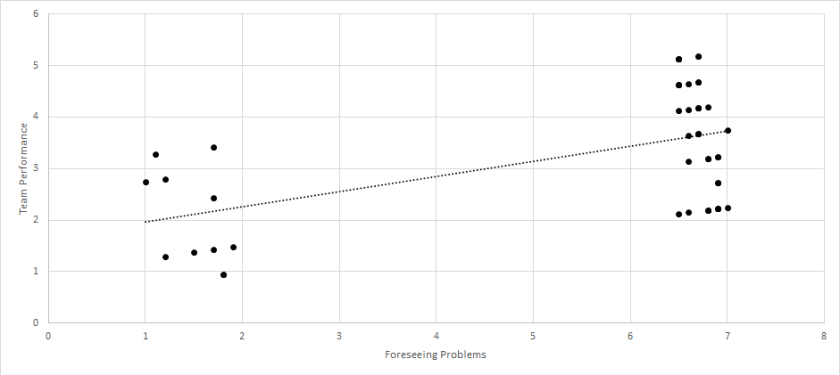
Well, let’s look at the self-efficacy and job performance example again with a correlation of .40.  If we had a representative sample of 300 people, the result might look something like this:

Example 1

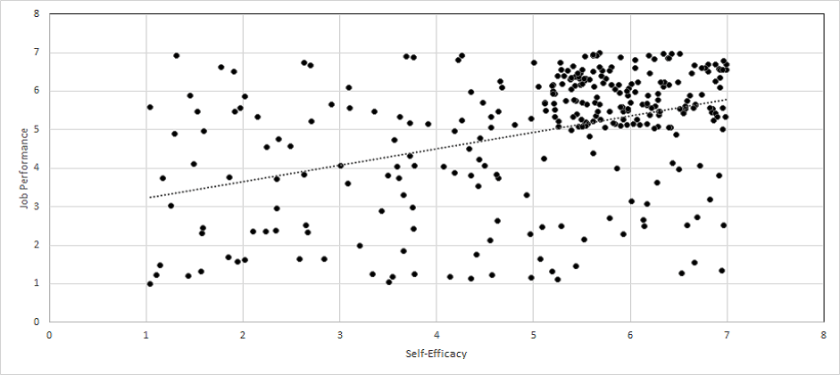
Not too bad – the regression line shows a clear, increasing relationship.  Now, let’s take 150 of these people and graph the results again:

Example 2

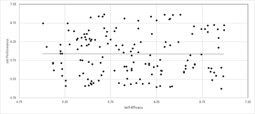
Woah!  Big difference!  Now the correlation between the two is literally .00, and we only removed half of the participants.  What happened?

As you guessed, I did not take a random subset of the 300 people.  Instead, I selected only those that scored five or above on the self-efficacy measure, as you can see with the differing axis labels in the two charts.  This resulted in the sample being non-representative (because everyone with a self-efficacy score under five was missing), and thereby the result was greatly different than the entire set of 300 people.

But could this ever happen in business?  Yes!  Imagine that you are feeling down about your work performance and unable to do the most basic tasks.  Then, you see an email about a job survey to measure self-efficacy and performance.  Would you take it?  Maybe, but a lot of people would just delete the email in order to avoid facing their lackluster self-perceptions, abilities, and performance.

Also, who would typically take those surveys anyways?  The grumpy employees that just want to do their work and go home?  Or the goodie-goodies that do whatever their boss asks?  I’d guess the latter, and the samples may not be representative of all these employees.

And think about those satisfaction surveys at restaurants.  Yes, people that really hated the service or really loved the service will complete them…but what about all the people in the middle?  Have you ever completed a satisfaction survey when the service was just okay?  I’m guessing not, which resulted in the results being non-representative.

So, whenever you need to collect data, be sure to carefully consider your sample size – not only for statistical power, but also for representativeness.  If you ignore these two aspects, then you could obtain results that are entirely misleading, and thereby implement policies that do nothing for your company – or worse!

Until next time, watch out for Statistical Bullshit!  And email me at MHoward@SouthAlabama.edu if you have any questions, comments, or anything else!


References

Brawley, A. M., & Pury, C. L. (2017). Little things that count: A call for organizational research on microbusinesses. Journal of Organizational Behavior, 38, 917-920.

Cohen, J. (1992a). Statistical power analysis. Current directions in psychological science, 1(3), 98-101.

Cohen, J. (1992b). A power primer. Psychological bulletin, 112(1), 155.

Murphy, K. R., Myors, B., & Wolach, A. (2014). Statistical power analysis: A simple and general model for traditional and modern hypothesis tests. Routledge.

What is in a Mean?

When are mean comparisons appropriate? And when are they Statistical Bullshit?

This post is inspired by an interaction that I had while consulting.  I was hired as a statistical analyst, and my duties included reviewing analyses that were already conducted internally.  Most of the organization’s prior analyses were appropriate, but I noticed that certain assumptions were based on completely inappropriate mean comparisons.  These assumptions led to needless practices that cost time and money – all because of Statistical Bullshit.  Today, I want to teach you how to avoid these issues.

Let’s first discuss when mean comparisons are appropriate.  Mean comparisons are appropriate if you (A) want to obtain a general understanding of a certain variable or (B) want to compare multiple groups on a certain outcome.  In the case of A, you may be interested in determining the average amount of time that a certain product takes to make.  From knowing this, you could then determine whether an employee is taking more or less time than the average to make the product.  In the case of B, you may be interested in determining whether a certain group performed better than another group, such as those that went through a new training program vs. those that went through the old training program.  The data from such a comparison may look something like this:

Training Comparison

So, from this comparison, you may be able to suggest that the new training program is more effective than the old training program; however, you would need to run a t-test in be sure of this.

Beyond these two situations, there are several other scenarios in which mean comparisons are appropriate, but let’s instead discuss an example when mean comparisons are inappropriate.

Say that we wanted to determine the relationship between two variables.  Let’s use satisfaction with pay (measured on a 1 to 7 Likert scale) and turnover intentions (also measured on a 1 to 7 Likert scale).  As you probably already know, we could (and probably should) determine the relationship between these two variables by calculating a correlation.  Imagine instead that you decided to calculate the mean of the two variables and the results looked like this:

Example 1

Does this result indicate that there is a significant relationship between the two variables?  In my prior consulting experience, the internal employee who ran a similar analysis believed this to be true.  That is, the internal employee believed that two variables with similar means are significantly related; however, this couldn’t be further from the truth.  Let’s look at the following examples to find out why.

Take the example that we just used – satisfaction with pay and turnover intentions.    Which of the following scatterplots do you believe represents the data in the bar chart above?

Example 2a

Example 2b

Example 2c

Example 2d

Still don’t know?  Here is a hint:  The first chart represents a correlation of 1, the second represents a correlation of -1, the third represents a correlation of 0, and the fourth represents a correlation of 0.  Any guesses?

Well, it was actually a trick question.  Each figure could represent the data in the bar chart above, because the X and Y variables in each have a mean of 4.75…well, the last one is off by a few tenths, but you get my point.

So, if the means of two variables are equal, their relationship could still be anything – ranging from a large negative relationship, to a null relationship, to a large positive relationship.  In other words, the means of two variables have nothing to do regarding their relationship.

But does it work the other way?  That is, if the means of two variables are extremely different, could they still have a significant relationship?

Certainly!  Let’s look at the following example using satisfaction with pay (still measured on a 1 to 7 Likert scale) and actual pay (measured in thousands of dollars).

Sat with Pay and Pay 2

As you can see, the difference in the means is so extreme that you can’t even see one bar!  Now, let’s look at the following four scatterplots:

Example 4a

Example 4b

Example 4c

Example 4d

Seem a little familiar?  As you guessed, the first represents a correlation of 1, the second represents a correlation of -1, the third represents a correlation of 0, and the fourth represents a correlation of 0.  More importantly, each of these include a Y variable with a mean of 4.75 and an X variable with a mean of 47500.  Although the means are extremely far apart, they have no influence on the relationship between two variables.

From these examples, it should be obvious that the mean of two variables has no influence on their relationship – no matter if the means are close together or far apart.  Instead, it is the covariation between the pairings of the X and Y values that determine the significance of their relationship, which may be a future topic on StatisticalBullshit.com or even MattCHoward.com (especially if I get enough requests for it).

Now that you’ve read this post, what will you say if you are ever at work and someone tries to tell you that two variables are related because they have similar means?  You should say STATISTICAL BULLSHIT!  Then demand that they calculate a correlation instead…or a regression…or a structural equation model…or other things that we may cover one day.

That’s all for this post!  Don’t forget to email any questions, comments, or stories.  My email is MHoward@SouthAlabama.edu, and I try to reply ASAP.  Until next time, watch out for Statistical Bullshit!