I recently had a reader of StatisticalBullshit.com tell me a story regarding the post, “What is in a Mean?” This story is a perfect illustration of Statistical Bullshit in industry, and why you should be aware of these and similar issues. I have done my best to retell it below (with a few details changed to ensure anonymity). As always, feel free to email me at MHoward@SouthAlabama.edu if you have any questions, comments, or stories. I would love to include your email on StatisticalBullshit.com. Until next time, watch out for Statistical Bullshit!
I was hired as a consultant for a company that recently had recently become obsessed with performance management. The top management of the company was recently under the impression that their workteams were terribly inefficient, and somehow they decided that the teams’ leadership was to blame. The company had given survey after survey, analyzed the data, interpreted the data, implemented new changes, and continuously monitored performance; however, the workteams were still not performing at the standard that they had hoped.
So, I was brought in to help fix the problem. My first decision was to review the surveys that the organization was using to measure performance and related factors. The surveys were very simple, but they weren’t terrible. First, performance was measured by having a member of top management rate the outcome of the workteam. Next, the leader of the workteam was rated by team members on 11 different attributes. These included:
- Managed Time Effectively
- Communicated with Team Members
- Foresaw Problems
- Displayed Proper Leadership Characteristics
- Transformed Team Members into Better People
Overall, I thought it wasn’t bad, and my second decision was to ask about prior analyses. When they delivered the prior analyses, I was confused that they only provided mean calculations. I immediately went to the top management and asked for the rest. They exasperatedly proclaimed, “Why do you need anything else!? The means are right there!”
I was taken aback. What!? They only calculated the means? I asked, “What do you mean by that?”
They sent me a table very similar to the following:
|
Mean Rating (From 1 to 7 Scale) |
|
|
Managed Time Effectively |
6.3 |
|
Communicated with Team Members |
5.9 |
|
Foresaw Problems |
5.5 |
|
Displayed Proper Leadership Characteristics |
6.1 |
|
Transformed Team Members into Better People |
2.5 |
“See! Our leaders are struggling with transforming team members into better people! This is obviously the problem, which is why we’ve made every leader enroll in mandatory transformation leadership courses.”
I immediately knew that this wasn’t right, but I needed a little time (and analyses) to make my case. I first calculated correlations of the related factors with team performance, and they looked like this:
|
Correlation with Team Performance |
|
|
Managed Time Effectively |
.24** |
|
Communicated with Team Members |
.32** |
|
Foresaw Problems |
.52** |
|
Displayed Proper Leadership Characteristics |
.17* |
|
Transformed Team Members into Better People |
.02 |
* p < .05, ** p < .01
A-ha! This could be the issue! While leaders could improve on transforming team members into better people, the data suggested that this factor did not have a significant effect on team performance. So, I then calculated a regression including all the related factors predicting team performance:
|
β |
|
|
Managed Time Effectively |
.170* |
|
Communicated with Team Members |
.082 |
|
Foresaw Problems |
.389** |
|
Displayed Proper Leadership Characteristics |
.113 |
|
Transformed Team Members into Better People |
.010 |
* p < .05, ** p < .01
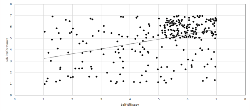
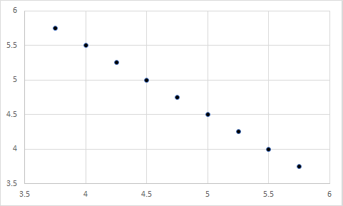
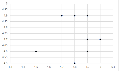
Again, the data suggested that transforming team members into better people did not have an effect on team performance. Instead, the strongest predictor was foreseeing problems. I lastly created a scatterplot of the relationship between foreseeing problems and team performance:
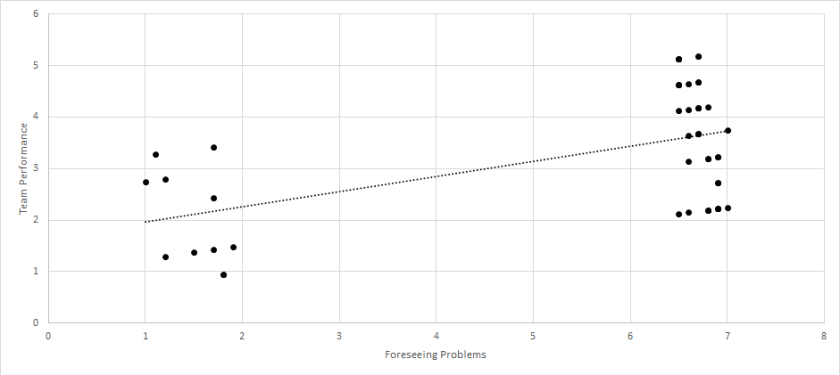
There is the problem! There were two groups of team leaders – those that could foresee problems and those that could not. Those that foresaw problems led teams with high performance, whereas those that could not foresee problems led teams with low performance. So, although the mean of foreseeing problems was not all that different from the other factors, it turned out to have the largest effect of them all. On the other hand, while transforming team members into better people had a mean that was much lower than the other factors, it did not have a significant effect at all.
With this information, I suggested that the organization should cut back on the transformational leadership training programs (after ensuring that they did not provide other benefits), and instead train leaders on how to anticipate problems. Through doing so, they could (a) save money (b) and finally reach the level of team performance that they had been wanting. I am unsure whether they implemented my recommendations, but I hope they learned a valuable lesson from my analyses:
Means should not be used to infer relationships between variables, and to always watch out for Statistical Bullshit – even if you accidentally do it yourself!
Note: The variables in this story have been changed to protect the identity of the reader. Please do not make management decisions based on these analyses.